Data exploration
Data exploration
Main PageGetting started with R
First of all:
- Install R from the web site Rproject. R is a open-source (i.e. free) software.
- Install Rstudio from the web site RStudio. RStudio allows the user to run R in a more user-friendly environment. It is a open-source (i.e. free) software.
RStudio screen is divided in several windows.
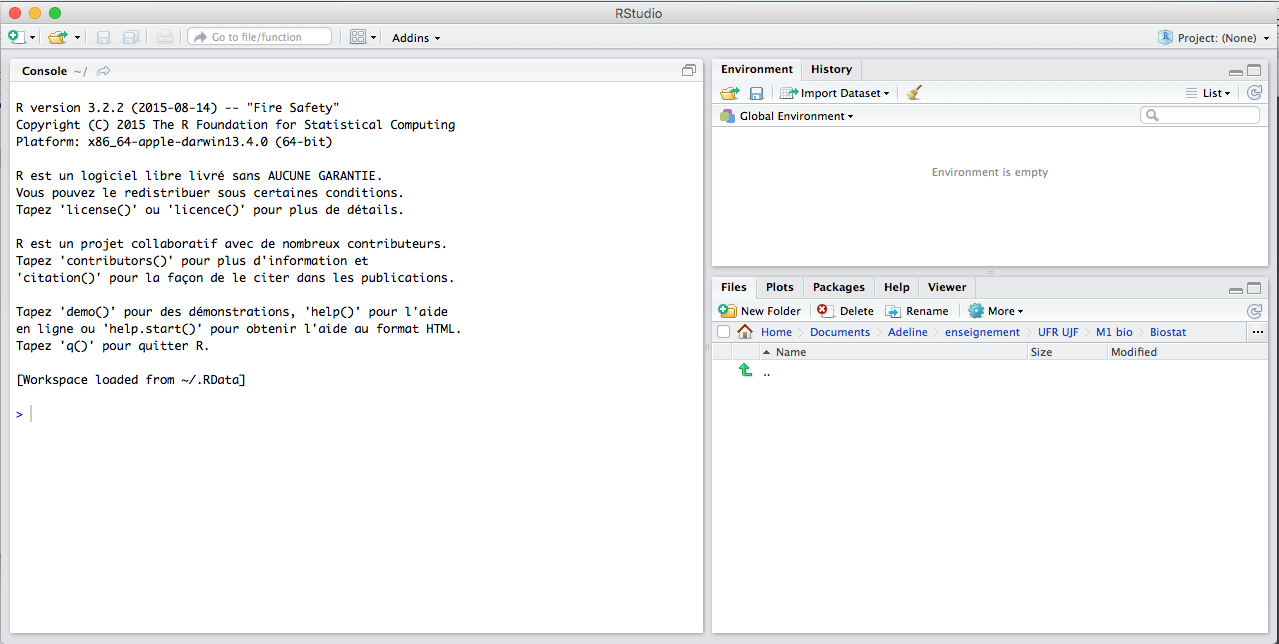
Alt text
- The console (lower left corner) is where you can type the commands and see output. Run the commands with Enter.
- The script (upper left corner) is where you can write the 'script' to save all your commands. Run them down to the lower left corner by Ctrl+R (Windows) or Cmd+Enter (Mac).
- The workspace (upper right corner) tab shows all the active objects. The workspace tab stores any object, value, function or anything you create during your R session. The {} tab shows a list of commands used so far. The history tab keeps a record of all previous commands.
- The files (lower right corner) tab show all the files and folders in your default workspace as if you were on a PC/Mac window. The plots tab will list a series of packages or add-ons needed to run certain processes. For additional info, see the help tab.
Create an object
An object can be created with the "assign" operator which is written as an arrow with a bracket and a minus sign.
R> n <- 10
One of the simplest commands is to type the name of an object to display its content.
R> n
[1] 10
The digit 1 within brackets indicates that the display starts at the first element of n.
R is case sensitive (lower case different from capital letters).
R> x <-1
R> X <-10
R> x
[1] 1
R> X
[1] 10
Note that you can type an expression without assigning its value to an object, the result is displayed on the console but not stored in memory:
R> (10 + 2) * 5
[1] 60
Basic R commands
Example: to create the vector (1,2,3,4,5), use the command
R> 1:5
[1] 1 2 3 4 5
The resulting vector has 5 elements. Arithmetic operators can be used:
R> 1:5-1
[1] 0 1 2 3 4
R> 1:(5-1)
[1] 1 2 3 4
Example: add a value 6 to the vector X equal to (1,2,3,4,5):
R> X <- 1:5
R> c(X,6)
[1] 1 2 3 4 5 6
Example: create a vector with 10 elements equal to 1:
R> rep(1, 10)
 [1] 1 1 1 1 1 1 1 1 1 1
Example: Create first the vector Y <- c(1,4,9, 16, 25). Check the length of Y and bind the two vectors X and Y:
R> Y <- c(1,4,9, 16, 25)
R> cbind(X,Y)
     X  Y
[1,] 1  1
[2,] 2  4
[3,] 3  9
[4,] 4 16
[5,] 5 25
Example: Bind the two vectors X and Y in row:
R> rbind(X,Y)
  [,1] [,2] [,3] [,4] [,5]
X    1    2    3    4    5
Y    1    4    9   16   25
Example: Create a matrix with elements from 1 to 6, with 2 rows and 3 columns:
R> A <- matrix(1:6,2)
R> A
     [,1] [,2] [,3]
[1,]    1    3    5
[2,]    2    4    6
Example:
R> XY <- cbind(1:10,11:20)
R> dim(XY)
[1] 10  2
Accessing the values of an object
Example: display the third element of X and Y:
Example:
Example:
R> head(XY)
     [,1] [,2]
[1,]    1   11
[2,]    2   12
[3,]    3   13
[4,]    4   14
[5,]    5   15
[6,]    6   16
Example:
R> colnames(A) <- c("a", "b", "c")
R>  A
     a b c
[1,] 1 3 5
[2,] 2 4 6
R>  A<-as.data.frame(A)
R>  A$a
[1] 1 2
A few functions
Example:
R> sum(X)
[1] 15
Example:
R> cumsum(X)
[1]  1  3  6 10 15
Example:
R> rowSums(XY)
 [1] 12 14 16 18 20 22 24 26 28 30
R> colSums(XY)
[1]  55 155
Operators
R> 2^2
[1] 4
Example
R> x <- 0.5
R> (0 < x)
[1] TRUE
R> x <- 1:3
R> y <- 1:3
R> (x == y)
[1] TRUE TRUE TRUE
Example:
R> x<-1:6
R> y<-4:9
R> (x>5)
[1] FALSE FALSE FALSE FALSE FALSE  TRUE
R> ! (x>5)
[1]  TRUE  TRUE  TRUE  TRUE  TRUE FALSE
R> (x<3)&(y>4)
[1] FALSE  TRUE FALSE FALSE FALSE FALSE
R> (x<5)&(y>4)
[1] FALSE  TRUE  TRUE  TRUE FALSE FALSE
Reading data in a file
For reading and writing in files, R uses the working directory. To find this directory, the command getwd() (get working directory) can be used, and the working directory can be changed with setwd("C:/data"). It is necessary to give the path to a file if it is not in the working directory.
Data can be read with the function read.table or scan. The function read.table creates a data frame. For instance, a file named datafile.csv can be read:
R> mydata <- read.table("data/datafile.csv")
In that command, mydata is the name you choose for the data frame. By defaults, each variable of the data frame is named V1, V2, .... They can be accessed individually by mydata$V1, mydata$V2, ... or by mydata["V1"], mydata["V2"], ... or by mydata[, 1], mydata[, 2], ....
All the options of the function read.table are described in the help file. For example, if the file contains the names of the variables on its first line, we can use the option header, if the cells are separated by ; , we can use the option sep=";":
R> XY <- read.table("data/datafile.csv",header=TRUE,sep=";")
Example To upload the data set called bosson.csv, run the following instruction:
R> B <- read.table("data/bosson.csv", header=TRUE, sep=";")
To check if the data were correctly loaded, use the function head that displays the first 6 rows of the dataset:
R> head(B)
  country gender aneurysm    bmi risk
1 Vietnam      M       21 21.094    0
2 Vietnam      M       27 19.031    0
3 Vietnam      M       28 20.313    0
4 Vietnam      F       33 17.778    0
5  France      F       34 21.604    0
6 Vietnam      F       35 21.096    0
All the values of the first six rows are displayed, the first two are categorical, the others are numerical.
Opening a dataset
Before starting with data analysis, one should be aware of different types of data and ways to organize data in computer files.
Some basic terms
For a given study, a target population has to be specified: on which subjects we will generalize or use the results?
In general, a sample should be representative for the target population.
The observation is often a human, sometimes also an animal, plant or anything else.
Example: In the Bosson dataset, the unit of the study is a patient, the sample is the collection of the 209 patients. The population is all the patients with aneurysm.
The numeric results obtained from the dataset will be used to draw conclusions about the target population.
Example: The variables of Bosson are
countryqualitative categorical variablegendera qualitative categorical variableaneurysma quantitative continuous variablebmia quantitative continuous variableriska quantitative discrete variable
R> B <- read.table("data/bosson.csv", header=TRUE, sep=";")
R> names(B)
[1] "country"  "gender"   "aneurysm" "bmi"      "risk"
Organization of data
A dataset is mostly organized in a form of a matrix, also viewed as a table or a spreadsheets. Usually, the rows correspond to the individuals, over which statistical variables are observed. Then each column contains the values of a statistical variable, over all individuals.
Example: A data matrix representing sex (1-male; 0-female), age, number of children, weight (kg), and height (cm) of 7 individuals:Each row of such a matrix represents one observation. All rows have the same length: the same data has been recorded for all individuals. Each column represents one variable. For instance, WEIGHT is the name of a variable, representing the body weight (in kg) of an individual.
Opening a dataset usually requires the following steps:
- Understand the experimental setting, the meaning of individuals and variables.
- Load the dataset using the function
read.tableand give it a name. - Display the first six rows by
head(mydata). Check if the dataset has been correctly imported. Display the number of rows and columns bydim(mydata). - Sort variables into three types:
- identifier: usually a name for each individual (e.g. names of countries, two-letter code for states,. . . ). Identifiers are not considered as statistical variables.
- discrete: all qualitative variables are discrete. A numerical variable for which the different values are fixed, is discrete. The number of different values of a discrete variable is usually much smaller than the number of individuals.
- continuous: numerical variables which can take any value in some interval are continuous. The number of different values of a continuous variable is usually (almost) as large as the number of individuals.
If you are not sure whether a numerical variable X should be treated as discrete or continuous, ask yourself whether any value between the maximum and the minimum could be taken: if the answer is yes, then X is continuous. If it is still unclear, display X: if the table is large, treat X as continuous.
Example: Load the dataset Bosson.
R> B <- read.table("data/bosson.csv", header=TRUE, sep=";")
R> head(B)
  country gender aneurysm    bmi risk
1 Vietnam      M       21 21.094    0
2 Vietnam      M       27 19.031    0
3 Vietnam      M       28 20.313    0
4 Vietnam      F       33 17.778    0
5  France      F       34 21.604    0
6 Vietnam      F       35 21.096    0
R> dim(B)
[1] 209   5
Country, Gender are categorical variables; Aneurysm, bmi, risk are quantitative variables.
Vocabulary of statistics
Qualitative variable
Let X be a qualitative variable. Mean and standard deviation do not make much sense. To see the distribution of the variable, we can compute:
Example:
From the dataset B, we can compute the absolute frequency of the variable country.
R> C<-B$country
R> table(C)
C
 France Vietnam
     99     110
The absolute frequency (number) of male/female is obtained with:
R> G<-B$gender R> table(G) G F M 51 158We can also compute the relative frequency:
Example: Relative frequencies of patients without any risk factor:
R> Ri<-B$risk
R> prop.table(table(Ri))
Ri
          0           1           2           3           4           5
0.191387560 0.387559809 0.291866029 0.105263158 0.019138756 0.004784689
Relative frequencies of Vietnamese:
R> prop.table(table(G))
G
        F         M
0.2440191 0.7559809
A qualitative variable can be graphically represented by a barplot:
Pie charts also exist (pie()) but are usually misleading and should be avoided.
R> barplot(table(Ri), main="Absolute frequencies of number of risk factors", ylab="frequency")
Résultat : 
Discrete quantitative variable
Let X be a discrete quantitative variable.
Example: Description of the number of risk factors in the Bosson dataset.
R> Ri<-B$risk
R> table(Ri)
Ri
 0  1  2  3  4  5
40 81 61 22  4  1
R> round(prop.table(table(Ri)),3)
Ri
    0     1     2     3     4     5
0.191 0.388 0.292 0.105 0.019 0.005
Note that the relative frequencies are rounded with only 3 digits (function round).
Computation of the mean, standard deviation number of risk factors:
R> mean(Ri)
[1] 1.38756
R> sd(Ri)
[1] 1.003857
Let us now compute the quartiles.
R> median(Ri)
[1] 1
R> quantile(Ri, c(0.25, 0.75))
25% 75%
  1   2
The function summary computes the three quartiles, the mean, the minimum and maximum values, and the number of missing values.
R>  summary(Ri)
   Min. 1st Qu.  Median    Mean 3rd Qu.    Max.
  0.000   1.000   1.000   1.388   2.000   5.000
A discrete variable can be represented by a barplot.
R> barplot(table(Ri), ylab="absolute frequency", xlab="number of risk factors")
R> barplot(prop.table(table(Ri)), ylab="proportion", xlab="number of risk factors")
Résultat : 
Continous quantitative variable
Let X be a continuous quantitative variable.
Example: Description of patient body mass index (bmi) in the Bosson data set.
R> b<-B$bmi R> summary(b) Min. 1st Qu. Median Mean 3rd Qu. Max. 13.33 19.23 22.21 22.76 26.37 36.16 R> sd(b) [1] 4.294087 R> IQR(b) [1] 7.138Code R :
R> par(mfrow=c(2,2))
R> hist(rnorm(1000, 10,1), prob=T, xlab="", main = "symmetric", cex.main=3)
R> hist(rexp(5000, 10), prob=T, xlab="", main = "right skewed", cex.main=3)
R> hist(1-rexp(5000, 10), prob=T, xlab="", main = "left skewed", cex.main=3)
R> hist(c(rnorm(1000, 10,1), rnorm(1000, 15,1)), prob=T, xlab="", main = "bimodal", cex.main=3)
Résultat : 
Example: Distribution of the variable bmi in the Bosson dataset.


R> plot(ecdf(b))
R> abline(v=median(b), col="red")
R> abline(h=0.5, col="red")
R> abline(v=quantile(b, 0.25), col="green")
R> abline(h=0.25, col="green")
R> abline(v=quantile(b, 0.75), col="blue")
R> abline(h=0.75, col="blue")
Résultat : 
One can read the median (red), the first and third quartiles (green and blue) on the ecdf plot.
Summarizing/presenting couples of variables
Two qualitative or discrete variables
Let (X, Y) be a couple of discrete variables, observed on the same population. Some definitions to describe the distribution of the two variablesExample: Joint distribution of variables country and risk factors of the Bosson dataset.
R> C<-B$country
R> Ri<-B$risk
R> table(C,Ri)
         Ri
C          0  1  2  3  4  5
  France  17 29 32 16  4  1
  Vietnam 23 52 29  6  0  0
R> prop.table(table(C,Ri)) # marginal distribution
         Ri
C                   0           1           2           3           4
  France  0.081339713 0.138755981 0.153110048 0.076555024 0.019138756
  Vietnam 0.110047847 0.248803828 0.138755981 0.028708134 0.000000000
         Ri
C                   5
  France  0.004784689
  Vietnam 0.000000000
A barplot represents the joint distribution with the option beside.
R> barplot(table(C,Ri), beside=TRUE, legend.text=c("France", "Vietnam"))
Résultat : 
The conditional distribution is informative when studying the association between the two variables:
R> C<-B$country
R> Ri<-B$risk
R> prop.table(table(C,Ri),1) # row percentages
         Ri
C                  0          1          2          3          4          5
  France  0.17171717 0.29292929 0.32323232 0.16161616 0.04040404 0.01010101
  Vietnam 0.20909091 0.47272727 0.26363636 0.05454545 0.00000000 0.00000000
R> prop.table(table(C,Ri),2) # column percentages
         Ri
C                 0         1         2         3         4         5
  France  0.4250000 0.3580247 0.5245902 0.7272727 1.0000000 1.0000000
  Vietnam 0.5750000 0.6419753 0.4754098 0.2727273 0.0000000 0.0000000
The proportion of patients with 2 risk factors among French patients is 32.32%. The proportion of Vietnamese patients among patients with 1 risk factor is 64.19%.
The visualisation of the conditional frequencies shows that the conditional distributions are slightly different: Code R :R> TCRi<-prop.table(table(C,Ri),1) # row percentages R> barplot(TCRi, beside=TRUE, legend.text=c("France", "Vietnam"))
Résultat : 
A qualitative and a quantitative variable
Let X be a qualitative or discrete variable and Y a continuous variable, observed on the same population. Some definitions to describe the distribution of the two variablesExample: Conditional distribution of variables bmi given the country, from the Bosson dataset.
R> b<-B$bmi
R> by(b, C, summary)
C: France
   Min. 1st Qu.  Median    Mean 3rd Qu.    Max.
  17.82   23.97   26.22   25.94   27.43   36.16
------------------------------------------------------------
C: Vietnam
   Min. 1st Qu.  Median    Mean 3rd Qu.    Max.
  13.33   18.08   19.75   19.90   22.01   27.34
The mean of bmi among French patients is 25.94, while the mean among Vietnamese patients is 19.90. The two conditional distributions are rather different. This is confirmed by the two boxplots of the bmi given the country:
Code R :R> boxplot(b~C)
Résultat : 
Two quantitative variables
Let (X, Y) be a couple of continuous variables, observed on the same population.
Example: Correlation of the bmi and the aneurysm size from the Bosson dataset:
R> b<-B$bmi
R> A<-B$aneurysm
R> cor(b,A)
[1] 0.2386002
The correlation is medium and non-negative, as confirmed by the scatter plot: Code R :
R> plot(b,A)
Résultat : 